
The key word is “Pleasing”. We’re going to cover a lot of theory in this article, but in the end, we need to understand that we’re going to try to achieve an image that is pleasing to look at.
This article is an in-depth view into Composition as mentioned in our Visual Storytelling Article
There is a lot of artwork one can access inside the web. I think that the first thing an artist should do before starting a new project is to dive into Artstation, Behance, CGSociety, or any platform full of great artist forums and swim through all the awesome art you can find. countless were the times I went to Artstation, selected the Architectural Visualization Subject and just scrolled like there was no tomorrow. From this point and on, we will enter the domain of subjectivity, so every rule will be there as a guide and nothing more than that.

During this exercise of browsing through art pieces, you will find some works more pleasant than others. There could be several reasons for why that is, of course, but even if we’re looking at gorgeous artwork, we may find that some of the pieces that nailed every technical aspect on modeling, texturing, lighting and rendering are lacking a key element- that element which keeps us hanging on the canvas, so because of that lack, our sight’s journey ends in a shipwreck across the frame. There is no defined point of interest. Our focus just rambles around and we move to another artwork.
Which magic element is missing? none. Just math. To put this whole idea in context, we should go back to the fifth century BC when the Greek mathematicians realized how important the golden ratio, as we call it now, was in the geometry of regular pentagrams and pentagons. But it was in 300 BC when the first known definition was coined:
“A straight line is said to have been cut in extreme and mean ratio when, as the whole line is to the greater segment, so is the greater to the lesser.”

From this point and forward in history, the golden ratio was studied, analyzed, interpreted and over-utilized by a big number of artists, writers, architects and so on. But it was Luca Pacioli who published a book in 1509 called Divina Proportione which connects the irrational number with the concept of pleasing and harmonious in art terms.

So can anyone express if the artwork is well composed in terms of balance, tension and focus elements? Yes, but based on these guides which were understood as rules for pleasant and harmonious pictures. There is no absolute rule which lets us understand absolute beauty, nevertheless, when we see an artwork something feels ok when it’s well composed, just as in Music, we hear a nice beat or we enjoy the harmony of a chord resonating. We have associated math with harmony and pleasantness for a long time ago. Why? Well, that can be analyzed in an anthropological article. Today we’re going to use some of the guides we know and understand how to use it and how those guides improve our artwork.

Now that I scratched the surface of this huge topic, how can you start testing it in your preferred 2D/3D software? Well, is very easy.
In my case, I use Blender, and in this software, you need to add a camera and search for the viewport display options in the camera icon. You will find a lot of composition guides to play with. I’m sure it will be just that easy in any 3D software.
The golden ratio is expressed as rectangles and squares, similar to how is the Fibonacci sequence expressed. The convergence between the Fibonacci sequence and the golden ratio was noticed by a German mathematician in 1564.

In the artwork above, you can see how the point of interest was deliberately placed just where the golden ratio converges.
There are a lot of things you can do to play with composition. I will mention three elements you can use that will affect the frame composition.
You can move the camera around from the camera point of view with a composition guide selected as an overlay until you find a good framing that looks pleasant to you. Another option could be to set the camera fixed in a point and play with the shapes until you get the desired amount of tension or balance inside the frame. But you have a third element which is the light.
The light is a key element to draw attention to wherever you need and it helps to show the small particles floating all over the converged area adding life, movement, gravity, and a pleasant lightness feeling.

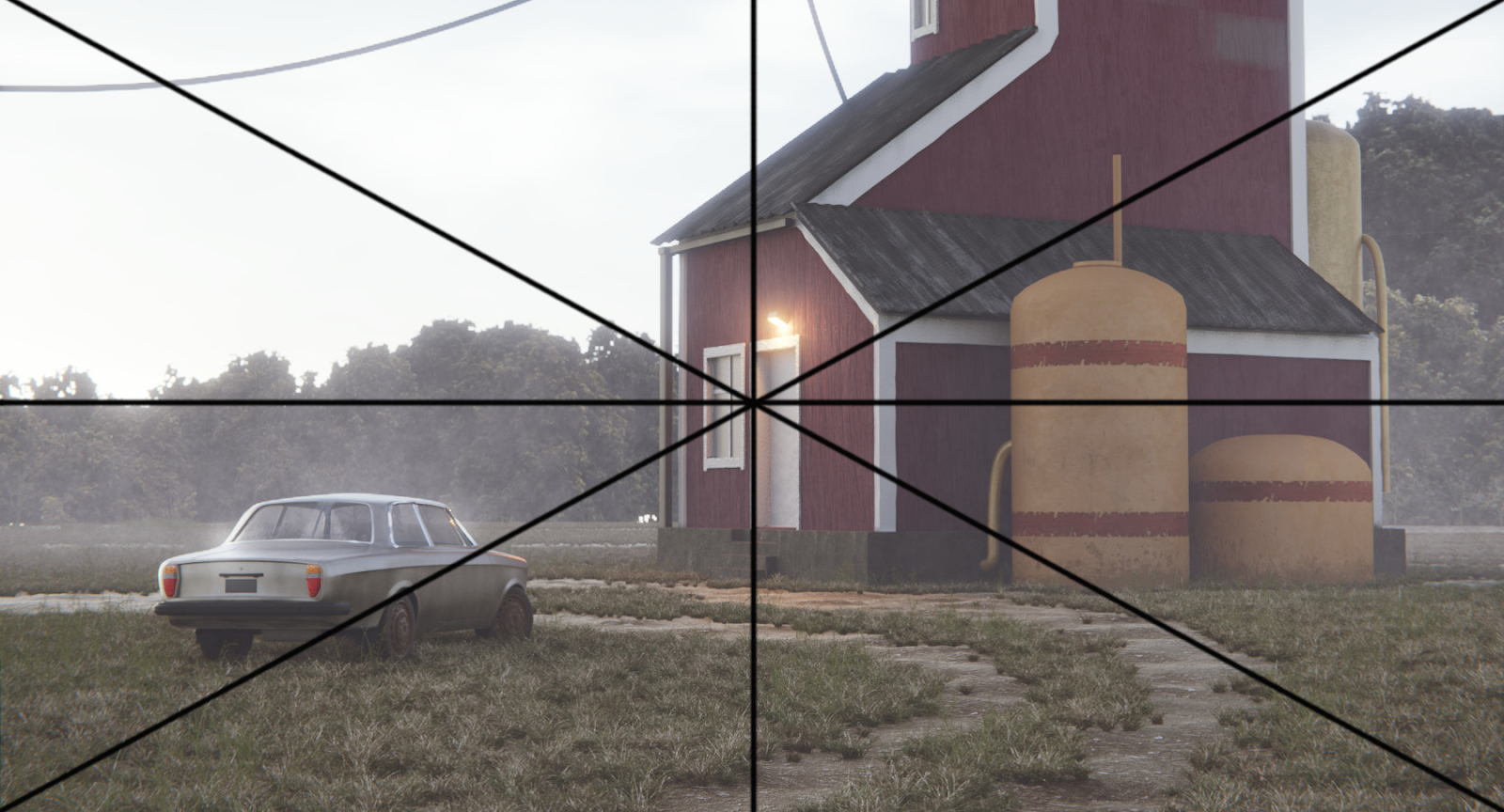
In the artwork above, you can see how this composition is driving the eye over the car. As I said above, light can be a powerful tool to balance the composition. In this case, the light will fight against the car for your attention and will try to drive the eye over these center diagonal lines.
Of course, I can draw lines along a lot of pieces and try to find the composition under any guide, but one can not deny how pleasant an image looks when the focal point hits a power point.
The first register of the rule of thirds on a book was in the eighteenth century. In it, an English painter named John smith discussed the balance of dark and light in a painting from a very disruptive and personal point of view.
The subjective perspective from John Smith stated that in a painting or an artwork, the fact of having two distinct, equal lights, should be avoided. There must be always one subordinating the other.
We can understand this way of thinking if we analyze the core of an imperialist civilization which finds it out of place to have a balance between light and dark.
But leaving the idiosyncrasy of the rule aside, the initial concept was trying to achieve a pleasant image by letting the dark or light portion of the painting take over two-thirds of the entire canvas.
John Smith also thought it was a good idea to use this rule where various lines in a picture broke the homogeneity of the colors. A good example of this would be a landscape when the sky can take the top two thirds while the hill takes only one-third of the canvas.
You can see in my next piece how this was considered to balance the sky and ground following John’s statements.

This so-called rule is actually a guide so don’t feel bound to it, these are not laws, just simple guides you can bend and even break.
The rule of thirds can be used to place the subjects inside a piece. The intersections between those four lines create four attention points that could be filled with anything you want the viewer to feel interpolated with.

In the image above, I used the attention points to focus on the chair, the table, and on the top left, I wanted to take the focus to the absence of what was supposed to be there: the bookshelf. I was also trying to achieve a moderate amount of tension.
In this artwork, I tried to use the diagonals to add drama to the scene using the light to fight against the dark almost in equal portions. As you noticed, I don’t have an imperialist core.
This is the less known composition guide of all the guides you will find inside your camera viewport display in your preferred 3D/2D software.
In my opinion, if you can use it properly, you will end up with a very dramatic angle that will provide a lot of tension to the final canvas.
You will have a hard time spotting this composition on other artist artworks, but when you find one, you will know right away. It is usually achieved by the use of wide camera lenses or complex framing.
You will end up with 4 triangles and need to fill one with the main subject in your piece. To achieve this, due to the diagonal the triangle produces, you need to arrange the subject in a way that it moves smoothly along the canvas in a perfect diagonal from one point of the frame to the opposite one.

You can see how I filled the entire lower triangle with the subjects that are driving the attention and how the entire color drivers are along the big diagonal.
As in every aspect of life, you’ll find people who love and live for the composition guides and people who think these are garbage. There is a famous architect who based his entire design philosophy around the harmony and proportions these kinds of guides can provide. Maybe the biggest debate is in the fact that there are people who think that math is the blueprint of the universe and people who think that math is just another human invention that we give too much importance to.


